
Understanding Your Google Data Studio Report: A Quick Overview
Being a good partner is about more than just giving you the tools to help you grow your Montessori school online. When our Nido Marketing members understand how those tools work and what they do, they have a better idea of why they’re so important to a successful digital marketing campaign.
A great example is the monthly Google Data Studio report we send to members who use our Google Ads management service.
What is Google Data Studio?
Google Data Studio is a pretty nifty tool that lets you see exactly how your different marketing channels are performing in real time.
Because it connects seamlessly with data sources like Google AdWords and Google Analytics, Google Data Studio helps to track key performance indicators (KPIs) so we can see what’s working and what’s not. Then, changes can be made to your marketing strategy based on the information gathered.
Making sense of your Google Data Studio report
Your monthly report provides a breakdown of all the information relevant to your campaign, from conversions and KPIs to how your Facebook ads are performing.
At the top of each report, you’ll see your school name and an interactive calendar that allows you to change the date range to view results for the last week, month, quarter, year, etc. So, if you wanted to compare this month to last month, or this month to the same month last year, you can easily do that.
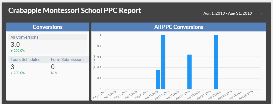
Next, you will see the Conversions section. The first number you’ll see indicates all conversions, and after that the data is customized to each school. So, for example, you may see things like Calls from Ads, Tours Scheduled, Tuition Information Requested, and Forms Submitted.
To the right of the Conversions section is a timeline showing all conversions during the time period specified on your interactive calendar.
From there, we move on to the Google AdWords KPIs section of the report.
Here you will see a variety of KPIs: Clicks, Impressions, Clickthrough Rate (CTR), Cost, Average Position (this section indicates where your ads appear on search pages and will soon be replaced by top and absolute top impressions), Average Cost per Click (CPC), Conversion Rate, Conversions, and Cost per Conversion.
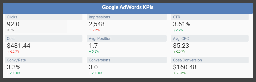
Red and green arrows indicate fluctuations for each KPI, with green representing a positive change and red a negative change. This data is critical because conversions are the most important part of your campaign.
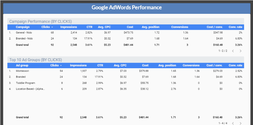
The next section looks at Google AdWords performance and is broken down by campaign. You can easily view Campaign Performance by cost, as well as the Top 10 Ad Groups, the Top 10 Keywords, Device Performance (i.e., which devices are producing the most traffic), and Last 12 Months Performance to see how your campaign is progressing.
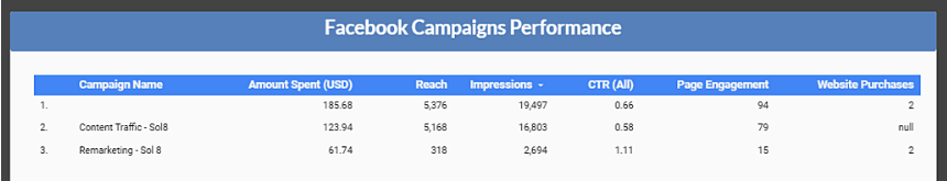
Finally, if Nido Marketing runs a Facebook ad campaign for your school, you will see your Facebook Campaigns Performance section at the bottom of the report, broken down into key metrics.
Again, one of the great things about your Google Data Studio report is that everything is interactive, so you can scroll and sort the data tables any way you’d like. And because the report is always working, whenever you want to view the campaign information for your Montessori school, you can simply open your latest report and find exactly what you need.
Of course, if you have any questions, we’ve got your back.
The Nido Marketing team is always standing by to help, so don’t hesitate to contact us if you need a little assistance interpreting your monthly Google Data Studio report. That’s what we’re here for!